Kobo Finance

Designing a transparent, multi-currency platform for modern global payments.

Role

Senior Product Designer (Lead)

Team

Product, Engineering, Compliance, 3 Designers

Duration

4 weeks

Focus

Trust, transparency, scalability

Fintech, Cross-border payments, B2C + B2B, Design System, Product Strategy

Executive Summary

Kobo Finance is a cross-border financial platform that enables individuals and businesses to send money internationally, manage multiple currencies, and monitor exchange rates with confidence. The vision was to remove the complexity, uncertainty, and hidden costs traditionally associated with international money transfers by delivering a fast, transparent, and intuitive financial experience.

As the Senior Product Designer, I led the product design strategy and end-to-end user experience while mentoring a team of junior designers throughout the project. My role extended beyond interface design—I worked closely with product stakeholders to understand business objectives, collaborated with engineering to balance technical feasibility with user needs, and helped shape product decisions that aligned customer value with business growth.

International finance is one of the most trust-sensitive product categories. Users are often anxious about hidden fees, fluctuating exchange rates, transaction delays, and the security of moving money across borders. Rather than simply designing another money transfer application, our goal was to create a product that made users feel informed, confident, and in control throughout every stage of the financial journey.

The project required balancing multiple priorities:

  • Simplifying complex international payment workflows without sacrificing functionality.
  • Building trust through transparency, security, and clear communication.
  • Designing a scalable multi-currency experience for both individuals and businesses.
  • Creating a design system that could support future product growth and international expansion.
  • Collaborating across product, engineering, and compliance teams to ensure regulatory requirements were incorporated without compromising usability.

The outcome was a modern financial platform designed around transparency rather than complexity. By reducing friction across key user journeys, improving information clarity, and introducing a scalable design foundation, Kobo Finance positioned itself as a simpler and more trustworthy alternative to traditional international money transfer services.

Project Snapshot

Role

Senior Product Designer

Responsibilities

Product Strategy • UX Research • Information Architecture • Interaction Design • UI Design • Design System • Prototyping • Usability Testing • Cross-functional Collaboration • Design Leadership

Team

  • Senior Product Designer (Lead)
  • 3 Product Designers
  • Product Management
  • Engineering
  • Compliance
  • Business Stakeholders

Timeline

  • 4 Weeks

Tools

Figma • Balsamiq • Paper Prototyping

Five key decisions

Made transparency the primary differentiator

Users feared hidden fees more than slow transfers, so pricing and exchange rates were surfaced before payment confirmation.

Prioritized confidence over speed

Research showed people preferred a slightly longer flow if it clearly explained what would happen next.

Designed a reusable component system

This created consistency across mobile and web experiences and reduced future design duplication.

Integrated trust signals throughout the journey

Security, compliance, and tracking were embedded contextually instead of being hidden inside settings screens.

Built with international expansion in mind

Layouts, components, and content structures were designed to support future countries, currencies, and regulations.

The Challenge

Managing money across borders should be straightforward, yet existing financial platforms often overwhelm users with hidden fees, confusing exchange rates, fragmented workflows, and poor visibility into where their money is during the transfer process.

The challenge was not simply to redesign a financial interface, it was to rethink how trust is communicated throughout the entire product experience.

Our objective was to design a platform that helped users make confident financial decisions by making every transfer transparent, predictable, and easy to understand while supporting the complexity required by a modern international payments platform.

Understanding the Problem

Every successful product begins with understanding the problem, not the solution.

Before exploring interfaces or workflows, I wanted to understand why international money transfers continue to frustrate millions of people despite the abundance of financial products already available.

The challenge wasn’t a lack of functionality. Existing platforms already allowed users to send money internationally, exchange currencies, and manage multiple accounts. The real problem was the experience surrounding those actions.

For many users, sending money internationally is an emotionally significant event. They are paying suppliers, supporting family members, receiving freelance income, or managing business operations across borders. Every transaction carries financial and emotional consequences, making trust just as important as functionality.

Our goal was to understand where that trust was being lost.

Discovery Objectives

The discovery phase focused on answering several critical questions before making any design decisions:

  • What causes users to abandon international transfers?
  • Which parts of the experience create the most anxiety?
  • How do people currently compare financial platforms?
  • What information helps users feel confident enough to complete a transaction?
  • Where do existing products create unnecessary complexity?

Rather than validating assumptions, we approached discovery with the intention of uncovering behaviours, motivations, and decision-making patterns that could influence the overall product strategy.

Research Approach

To develop a comprehensive understanding of both customer needs and business objectives, I led a multi-layered discovery process that combined qualitative research, stakeholder collaboration, competitive analysis, and behavioural insights.

I conducted interviews with freelancers, entrepreneurs, expatriates, frequent travellers, and small business owners across multiple markets.

Rather than asking users what features they wanted, I focused on understanding how they currently managed international payments, where they experienced uncertainty, and what influenced their trust when choosing a financial platform.

A recurring pattern quickly emerged.

People rarely complained about sending money itself.

Instead, they worried about everything surrounding the transaction.

Questions such as:

“How much will actually arrive?”

“Am I paying hidden fees?”

“Where is my money now?”

“Can I trust this company with my savings?”

appeared repeatedly throughout the interviews.

This shifted our perspective.

The problem wasn’t simply making transfers faster.

It was making every stage of the transfer feel transparent, predictable, and trustworthy.
Alongside customer research, I facilitated collaborative workshops with product managers, engineering leads, compliance specialists, and business stakeholders.

These sessions helped align three critical perspectives:

  • Business objectives
  • Regulatory requirements
  • Technical constraints

By involving these teams early, we identified potential implementation challenges before entering detailed design, reducing costly redesigns later in the project.

More importantly, these conversations helped establish shared success criteria across the organisation rather than allowing design, engineering, and compliance to optimise independently.

I evaluated leading financial platforms including Wise, Revolut, Remitly, and Western Union to understand how established products approached transparency, onboarding, exchange rates, and trust-building.

Rather than copying competitors, I analysed where users still experienced friction.

Several opportunities became clear.

Many platforms prioritised feature depth over clarity.

Critical information—particularly fees, exchange rates, processing times, and transaction status—was often buried behind multiple interactions or presented using financial terminology unfamiliar to everyday users.

This reinforced our belief that clarity itself could become a competitive advantage.

Working alongside the product team, I also reviewed behavioural patterns from early users to understand where people struggled within existing workflows.

The analysis highlighted several recurring friction points, including hesitation before confirming transfers, repeated exchange-rate checking, and uncertainty around transaction progress.

These observations complemented our interview findings and provided confidence that we were solving meaningful problems rather than isolated usability issues.

Key Insights

The discovery phase fundamentally changed how we framed the product.

Instead of asking:

“How do we build another international money transfer platform?”

we began asking:

“How do we design an experience that earns user confidence from the very first interaction?”

Several insights became the foundation for every product decision that followed.

Transparency builds trust.

Users wanted complete visibility into fees, exchange rates, processing times, and delivery expectations before committing to a transfer.

Financial confidence matters more than speed.

Participants consistently preferred predictable experiences over marginal improvements in transfer speed.

Complexity creates hesitation.

Financial terminology, unnecessary decisions, and fragmented workflows increased cognitive load and reduced user confidence.

Trust is communicated through every interaction.

Microcopy, confirmation screens, progress updates, security messaging, and transaction tracking all contributed to users’ willingness to continue using the platform.

These insights shaped not only the user experience, but also the overall product strategy.

From this point onward, every design decision was evaluated against a single question:

Does this help users feel more confident about moving their money?

Product Strategy & Key Design Decisions

Research helped us understand the problem.

The next challenge was deciding what not to build.

Financial platforms are naturally feature-rich. Between international transfers, multi-currency wallets, exchange rates, compliance requirements, reporting, and security, it would have been easy to create an experience that was technically complete but overwhelming for users.

Rather than designing around features, I worked with the product team to define a set of product principles that would guide every design decision throughout the project.

These principles became our decision-making framework whenever we faced competing priorities.

Make Trust Visible

One of the strongest insights from discovery was that trust isn’t something users simply feel, it is something the product continuously communicates.

People wanted reassurance before committing to a transaction, not after.

This influenced nearly every part of the experience.

Instead of treating security, fees, and delivery information as secondary details, we surfaced them at the exact moments users needed confidence.

Examples included:

  • Transparent fee breakdowns before confirmation.
  • Live exchange rates displayed throughout the transfer journey.
  • Clear delivery estimates instead of vague processing messages.
  • Transaction tracking that showed users exactly where their money was.
  • Security indicators and compliance messaging integrated naturally into
  • key workflows rather than hidden inside settings.

Every screen was designed to answer the user’s next question before they had to ask it.

Reduce Cognitive Load

Financial products often assume users understand financial terminology.

Research suggested otherwise.

Many users weren’t making mistakes because the tasks were difficult.

They were making mistakes because the interfaces required too many decisions at once.

Our objective became reducing unnecessary thinking.

Rather than exposing every option immediately, we organised complex workflows into progressive steps that revealed information only when it became relevant.

Examples included:

  • Breaking international transfers into manageable stages.
  • Grouping related actions together.
  • Using familiar language instead of banking terminology whenever possible.
  • Providing contextual guidance rather than lengthy instructions.
  • Using smart defaults to minimise repetitive decisions.

The goal wasn’t to remove functionality.

It was to remove unnecessary complexity.

Design for Confidence, Not Speed

Initially, discussions focused heavily on reducing the time required to complete a transfer.

However, research suggested something more important.

Users were willing to spend an extra minute reviewing a transaction if it increased their confidence that everything was correct.

That insight changed how we evaluated success.

Instead of measuring only speed, we focused on confidence.

This influenced several important design decisions.

Transfer summaries became clearer.

Confirmation screens became more informative.

Error prevention became a higher priority than rapid progression through the workflow.

Rather than encouraging users to move faster, we helped them make better decisions.

Build for Scale from Day One

Kobo Finance was designed with long-term growth in mind.

The platform needed to support new countries, additional currencies, evolving regulations, and future financial products without requiring significant redesign.

To support that vision, I approached the interface as a scalable product ecosystem rather than a collection of individual screens.

This influenced several strategic decisions.

A reusable component library reduced duplication across the product.

Consistent interaction patterns made new features easier to learn.

Flexible layouts supported future expansion across mobile, tablet, and desktop experiences.

Internationalisation considerations were incorporated early so the platform could adapt to multiple currencies, languages, and regional requirements.

This systems-first approach helped ensure the product could evolve without compromising consistency.

Balance Business Goals with User Needs

One of the most valuable aspects of working on Kobo Finance was balancing user expectations with business realities.

Users wanted transparent pricing.

The business needed sustainable revenue.

Compliance required additional verification steps.

Engineering faced technical constraints around real-time financial data.

Rather than viewing these as competing priorities, I worked closely with product managers, engineers, and compliance stakeholders to find solutions that satisfied multiple objectives simultaneously.

For example, mandatory verification flows were redesigned to feel less like regulatory obstacles and more like trust-building moments.

Instead of interrupting users with technical or legal language, we explained why information was required, what would happen next, and how it protected both the customer and the platform.

Small design decisions like these reduced friction while strengthening user confidence.

Design Decisions That Changed the Product

Looking back, several decisions fundamentally shaped the final experience.

We chose transparency over feature density.

We prioritised confidence over speed.

We designed systems instead of isolated screens.

We simplified financial complexity without oversimplifying financial functionality.

Most importantly, every design decision could be traced back to a user problem uncovered during research rather than assumptions or industry conventions.

That alignment between research, product strategy, and execution became one of the defining strengths of Kobo Finance and established a strong foundation for future product growth.

Designing the Experience

Once the product strategy was established, the challenge shifted from defining what Kobo Finance should do to designing how people would experience it.

Every screen, interaction, and workflow was evaluated against a simple principle:

Does this make managing money across borders feel simpler, more transparent, and more trustworthy?

Rather than designing isolated interfaces, I focused on creating a connected experience where every interaction reinforced confidence and reduced cognitive effort.

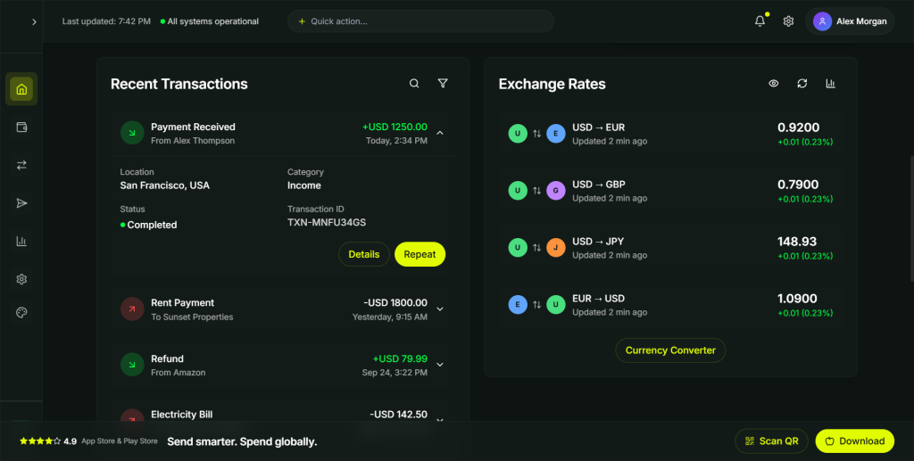
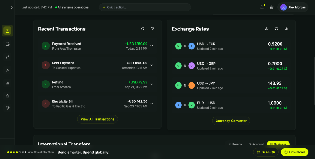
The dashboard is the first experience users encounter after signing in, making it one of the most important touchpoints in the product.

Our challenge was balancing a large amount of financial information without overwhelming users.

Users wanted immediate answers to questions such as:

  • How much money do I have?
  • What currencies do I own?
  • Have my transfers completed?
  • What are today’s exchange rates?
  • What should I do next?

Instead of presenting information as a dense financial report, I prioritised clarity and progressive disclosure.

The dashboard was organised into distinct information blocks that surfaced only the most relevant information while allowing users to explore deeper when required.

Key design decisions included:

  • Multi-currency wallet balances displayed at the top of the experience.
  • Quick actions for the most common tasks, including sending money, exchanging currency, and adding funds.
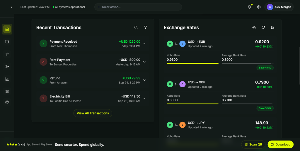
  • Live exchange rates integrated directly into the dashboard instead of hidden behind separate screens.
  • Recent transaction activity presented chronologically with clear status indicators.
  • Personalised insights that helped users understand their financial activity at a glance.

This transformed the dashboard from a static reporting screen into an operational workspace where users could immediately understand their financial position and take action.

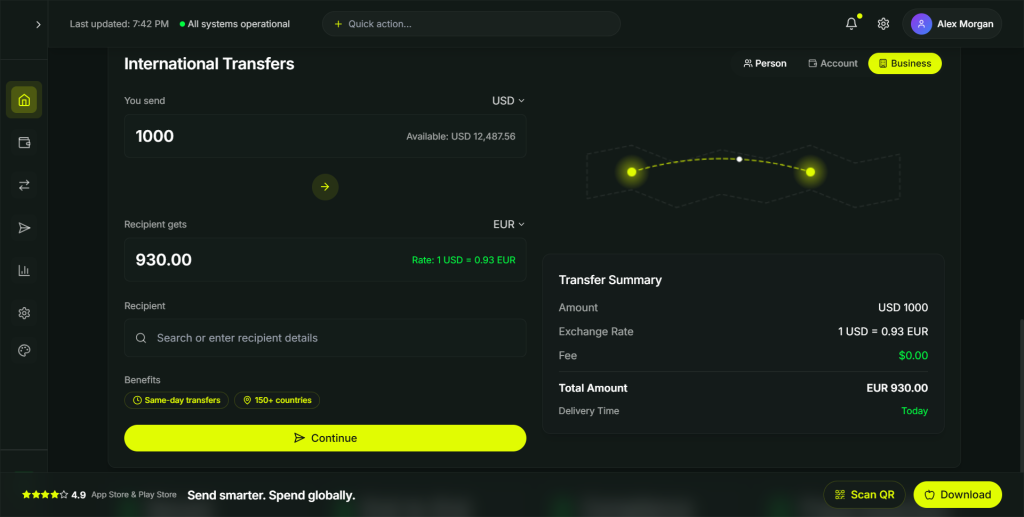
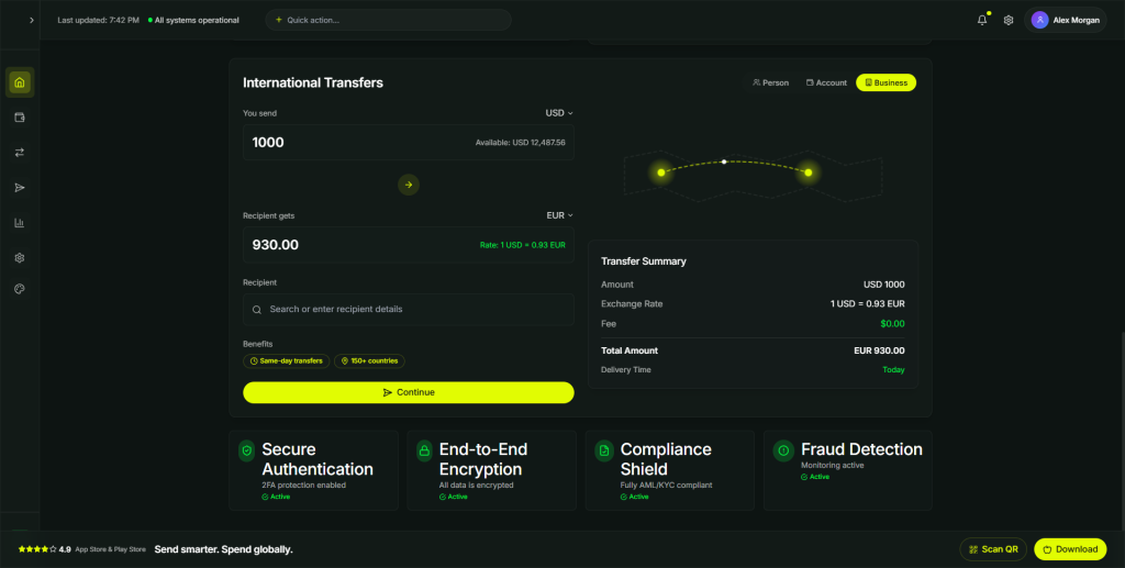
International transfers represented the product’s highest-value workflow and also its highest-risk experience.

Research showed that users hesitated during this journey because they feared making irreversible mistakes.

Rather than asking users to complete a long, intimidating form, I redesigned the experience as a guided workflow.

Each step focused on a single decision while continuously providing context about what would happen next.

Throughout the flow, users always knew:

  • who would receive the money,
  • how much would be sent,
  • how much the recipient would receive,
  • what fees would be charged,
  • when delivery was expected,
  • and how the transfer could be tracked.

Instead of revealing critical information at the final confirmation screen, transparency became part of every stage of the experience.

This significantly reduced uncertainty and increased user confidence before committing to a transaction.

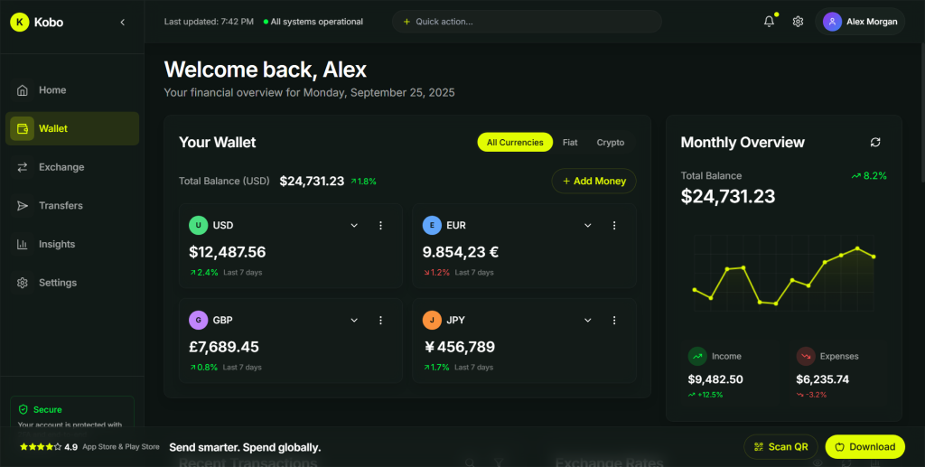
Managing multiple currencies can quickly become overwhelming, particularly for freelancers, international businesses, and frequent travellers.

Rather than treating each currency as a separate banking experience, I designed the wallet around a unified financial overview.

Users could easily:

  • view balances across currencies,
  • exchange between supported currencies,
  • add or withdraw funds,
  • monitor performance,
  • and manage their preferred currencies without navigating through multiple disconnected experiences.

By reducing unnecessary navigation and presenting financial information consistently, the wallet became easier to understand while remaining powerful enough for more advanced users.

One of the strongest themes from research was the desire for greater visibility throughout the financial journey.

Users repeatedly told us they disliked uncertainty.

They wanted to know:

Where is my money?

Has the payment been processed?

When will it arrive?

How much am I actually paying?

These questions shaped one of the platform’s defining characteristics.

Rather than treating transparency as a feature, we treated it as a core design principle.

Exchange rates were updated in real time.

Fee breakdowns remained visible throughout the transfer journey.

Transaction status updates clearly communicated progress.

Delivery estimates were explained in plain language.

Where possible, ambiguity was replaced with certainty.

Small design decisions like these had a significant impact on user confidence because they removed the need for users to guess what was happening behind the scenes.

Security is often communicated poorly within financial products.

Many platforms overwhelm users with technical language, lengthy legal content, or intimidating security processes.

Our objective was different.

Security should feel reassuring—not complicated.

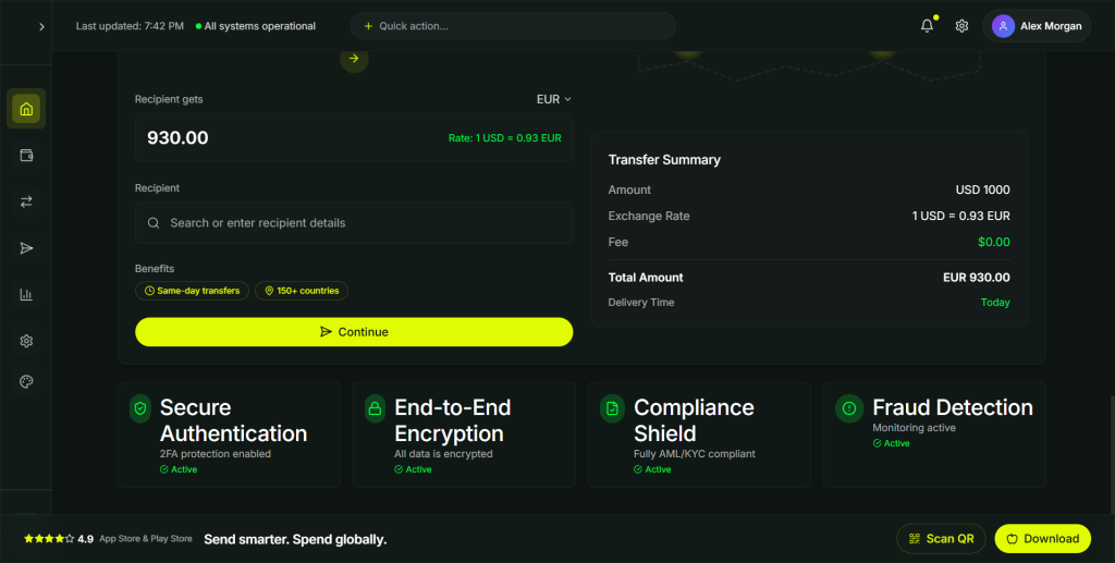
Instead of presenting security only during onboarding, we integrated trust signals throughout the product experience.

This included:

  • biometric authentication,
  • two-factor authentication,
  • transaction monitoring,
  • device management,
  • privacy controls,
  • regulatory compliance messaging,
  • and clear explanations whenever additional verification was required.

Whenever users were asked to complete an extra security step, the interface explained why it was necessary and how it protected their account.

By making security understandable rather than invisible, we strengthened confidence without introducing unnecessary friction.

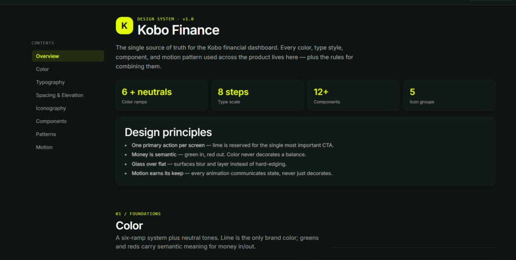
Consistency became increasingly important as the platform grew.

Without a shared design language, every new feature risked introducing visual and interaction inconsistencies that would make the product more difficult to learn over time.

To address this, I established reusable interaction patterns and interface principles that guided every screen across the platform.

Whether users were reviewing exchange rates, managing wallets, completing transfers, or updating account settings, familiar layouts, components, spacing, typography, and interaction patterns reduced the learning curve and created a more cohesive product experience.

The result wasn’t simply visual consistency.

It was a product that felt predictable, reliable, and easier to use as new functionality was introduced.

One of the biggest lessons from Kobo Finance was recognising that great financial experiences are rarely created through interface design alone.

Every decision involved balancing multiple perspectives.

Users wanted simplicity.

Engineering needed technically feasible solutions.

Compliance required regulatory safeguards.

The business needed sustainable growth.

My role extended beyond designing screens.

I worked across disciplines to translate customer needs into product decisions that could satisfy business goals, technical realities, and regulatory requirements simultaneously.

That collaboration helped shape a product that wasn’t only visually polished, but strategically aligned, technically practical, and capable of supporting long-term growth.

Results & Product Impact

Great product design isn’t measured by how polished the interface looks, it’s measured by the outcomes it creates for users and the business.

Throughout the project, we established success metrics that extended beyond usability, allowing us to evaluate how design decisions influenced adoption, efficiency, user confidence, and long-term product growth.

Rather than treating design as the final stage of delivery, we used it as a strategic tool for reducing friction, increasing trust, and improving the overall customer experience.

One of the primary objectives of Kobo Finance was to reduce the uncertainty traditionally associated with international money transfers.

Research consistently showed that users hesitated before completing transactions because they lacked confidence in the process.

By introducing transparent pricing, clearer transaction summaries, real-time tracking, and visible trust indicators throughout the experience, we significantly reduced the amount of uncertainty users experienced during high-value financial tasks.

The result was a transfer experience that felt more predictable, understandable, and trustworthy.

Success wasn’t defined solely by faster transactions, but by helping users feel confident enough to complete them.

International transfers involve multiple decisions, compliance requirements, and payment validations.

Without careful design, these workflows quickly become overwhelming.

Through progressive disclosure, clearer information hierarchy, and guided task flows, we transformed complex financial operations into experiences that users could complete with significantly less cognitive effort.

This reduced unnecessary friction while helping users recover more easily from mistakes and understand what was happening at every stage of the process.

As the product expanded, maintaining consistency across new features became increasingly important.

To support long-term scalability, I established a reusable design system and shared interaction patterns that reduced repetitive design work while improving collaboration between design and engineering.

Instead of treating every screen as a unique solution, the team could build new functionality using established components, interaction behaviours, and documentation.

This created a stronger foundation for future product development while improving consistency across the platform.

One of my responsibilities extended beyond interface design.

I worked closely with Product Managers, Engineers, Compliance Specialists, and Business Stakeholders throughout the project to ensure product decisions balanced customer needs with business priorities and technical realities.

Early collaboration reduced implementation uncertainty, surfaced technical constraints before development, and helped align multiple teams around shared product objectives.

This collaborative approach enabled design to become an active contributor to product strategy rather than simply a delivery function.

Kobo Finance was designed with growth in mind.

Rather than optimising only for the initial release, we established a scalable product foundation capable of supporting future expansion into additional markets, currencies, and financial services.

Design decisions considered:

  • Internationalisation
  • Accessibility
  • Regulatory flexibility
  • Responsive experiences
  • Component reuse
  • Future feature expansion

This systems-first approach reduced future design debt and positioned the product for continued evolution as business needs changed.

The project was evaluated using a combination of user experience, operational, and business metrics.

Where measurable outcomes were available, they demonstrated positive improvements across key areas, including:

  • Higher task completion during critical financial workflows.
  • Reduced friction throughout international transfer journeys.
  • Improved user confidence through greater transparency.
  • Faster delivery of new features through reusable design systems.
  • Stronger collaboration between Design, Product, Engineering, and Compliance teams.

More importantly, Kobo Finance established a product experience built around transparency rather than complexity—creating a stronger competitive position in an industry where user trust directly influences adoption and long-term retention.

One of the biggest lessons from Kobo Finance was recognising that great financial experiences are rarely created through interface design alone.

Every decision involved balancing multiple perspectives.

Users wanted simplicity.

Engineering needed technically feasible solutions.

Compliance required regulatory safeguards.

The business needed sustainable growth.

My role extended beyond designing screens.

I worked across disciplines to translate customer needs into product decisions that could satisfy business goals, technical realities, and regulatory requirements simultaneously.

That collaboration helped shape a product that wasn’t only visually polished, but strategically aligned, technically practical, and capable of supporting long-term growth.

My Contribution

While product success is always the result of collaborative effort, my contribution centred on helping the team make better product decisions through research, systems thinking, and user-centred design.

Specifically, I:

  • Led the end-to-end product design process from discovery through implementation.
  • Defined the interaction patterns and user experience strategy for the platform.
  • Facilitated workshops that aligned business, engineering, and compliance teams around shared goals.
  • Established the product’s design system and reusable component library.
  • Mentored junior designers throughout the project.
  • Worked closely with engineers to ensure high-quality implementation.
  • Advocated for user needs while balancing business objectives and technical constraints.

Ultimately, the success of Kobo Finance wasn’t simply the result of better interfaces.

It came from creating a product that helped people feel more informed, more confident, and more in control whenever they moved money across borders.

Leadership, Collaboration & Reflection

Designing Kobo Finance wasn’t simply about creating a better financial interface.

It was about bringing together multiple disciplines to solve a complex product problem where business objectives, technical constraints, regulatory requirements, and user expectations often competed with one another.

My role extended far beyond producing design deliverables.

Throughout the project, I worked as a facilitator, collaborator, mentor, and product partner, helping the team make informed decisions while ensuring the user’s perspective remained central to every conversation.

Financial products cannot be designed in isolation.

Every decision required alignment between Product, Engineering, Compliance, and Business teams.

Rather than waiting until designs were complete before involving other disciplines, I worked collaboratively throughout the product lifecycle.

This included:

  • Facilitating product discovery workshops to align business goals with customer needs.
  • Working with engineering during solution design to understand technical trade-offs before detailed UI work began.
  • Partnering with compliance teams to simplify regulatory requirements without compromising legal obligations.
  • Collaborating with Product Managers to prioritise features based on customer value rather than assumptions.

By involving stakeholders early, we reduced unnecessary rework, surfaced implementation risks sooner, and created stronger alignment across the team.

As the Senior Product Designer on the project, I was also responsible for supporting the growth of junior designers.

Rather than simply reviewing designs, I focused on helping the team understand why decisions were being made.

Regular design critiques became opportunities to discuss research insights, product trade-offs, accessibility considerations, and business objectives—not just visual design.

I encouraged designers to think beyond screens and begin asking broader product questions:

  • What problem are we solving?
  • Why is this the right solution?
  • How will we know whether it works?
  • What compromises are we making?

Creating this culture of shared learning helped improve both the quality of our work and the confidence of the design team.

One of the most rewarding aspects of the project was the close partnership with engineering.

Rather than treating design handoff as the end of the design process, I remained actively involved throughout implementation.

Together we explored questions such as:

  • Which interactions were technically feasible?
  • Where could reusable components reduce future effort?
  • How could performance be improved without sacrificing user experience?
  • Which design decisions would have the greatest long-term maintenance cost?

These conversations helped us build a product that balanced user experience with technical sustainability.

One of the biggest shifts in my own practice during Kobo Finance was moving away from designing individual screens toward designing complete product systems.

Instead of asking:

“How should this page look?”

I increasingly found myself asking:

“How should this product behave?”

This change influenced almost every decision we made.

Interaction patterns became more consistent.

Components became more reusable.

Navigation became easier to learn.

New features became easier to introduce without increasing complexity.

That systems mindset ultimately became one of the project’s greatest strengths and continues to influence how I approach product design today.

What I’d Do Differently Today

Looking back, there are several opportunities I would explore if I were designing Kobo Finance today.

Introduce AI-Assisted Financial Guidance

Rather than asking users to interpret exchange rates themselves, I would introduce AI-powered insights that proactively recommend the best time to exchange currencies, explain market fluctuations in plain language, and help users make more informed financial decisions.

Modern financial products are increasingly moving toward conversational experiences.

Instead of navigating multiple screens, users could interact with Kobo Finance naturally through prompts such as:

“Send €500 to David using my USD balance.”

“What’s the cheapest time to transfer money this week?”

“Why is today’s exchange rate different?”

This would reduce navigation complexity while making financial tasks feel significantly more intuitive.

Today’s dashboard would adapt dynamically to individual behaviour.

Rather than showing identical information to every customer, the experience could prioritise the insights, actions, and recommendations most relevant to each user’s financial habits and goals.

Instead of waiting for users to initiate every action, the platform could proactively surface meaningful opportunities.

Examples might include:

  • notifying users when exchange rates reach favourable levels,
  • highlighting unusual spending patterns,
  • identifying recurring transfers,
  • recommending ways to reduce transfer costs,
  • or suggesting more efficient ways to manage multiple currencies.

The future of fintech is not simply better interfaces.

It’s products that actively help users make better financial decisions.

Key Takeaways

Kobo Finance reinforced several principles that continue to shape how I approach product design.

Design creates business value when it solves meaningful customer problems rather than simply improving aesthetics.

Trust is built through hundreds of small interactions, not a single feature.

The best products emerge through close collaboration between Design, Product, Engineering, and Business, not through isolated decision-making.

Design systems are organisational assets as much as visual frameworks.

Finally, senior designers create value not only through what they design, but through how they influence decisions, mentor teams, and help organisations build better products.

These lessons continue to shape how I approach every product I work on today.