Before I begin any project, I try to understand the basics. This requires an understanding of two important aspects:
- The user (Users and their goals)
- The brand (Business goals)
The questions below may vary depending on the business and are not limited to the questions below.
- What’s is the problem?
- What issue are you trying to solve for your user?
- What problem are you trying to solve?
- How does this project fit into your overall brand mission and goal?
- What role does this project play in reaching that goal?
- Is now the ideal time for your business to pursue this project?
I undertake research once I’ve determined what this project’s fundamental objective is and what problems they’re attempting to solve. At this point, I prefer face-to-face interviews to measure verbal and nonverbal replies, although video or phone interviews was also used.
-
User Interview
-
Stakeholder Interview
-
Market Research
-
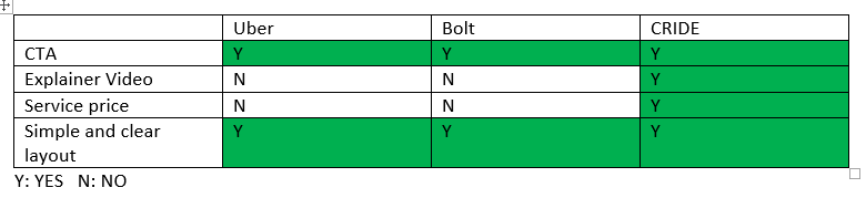
Competitor Analysis
The questions below may vary depending on the business and are not limited to the questions below.
- What are they having trouble with?
- What do people expect from the service?
In this step, I used all of the information obtained in the previous two phases to analyze and simplify the most relevant parts.
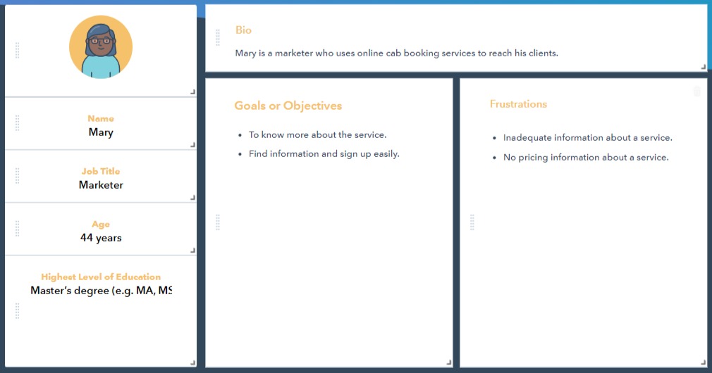
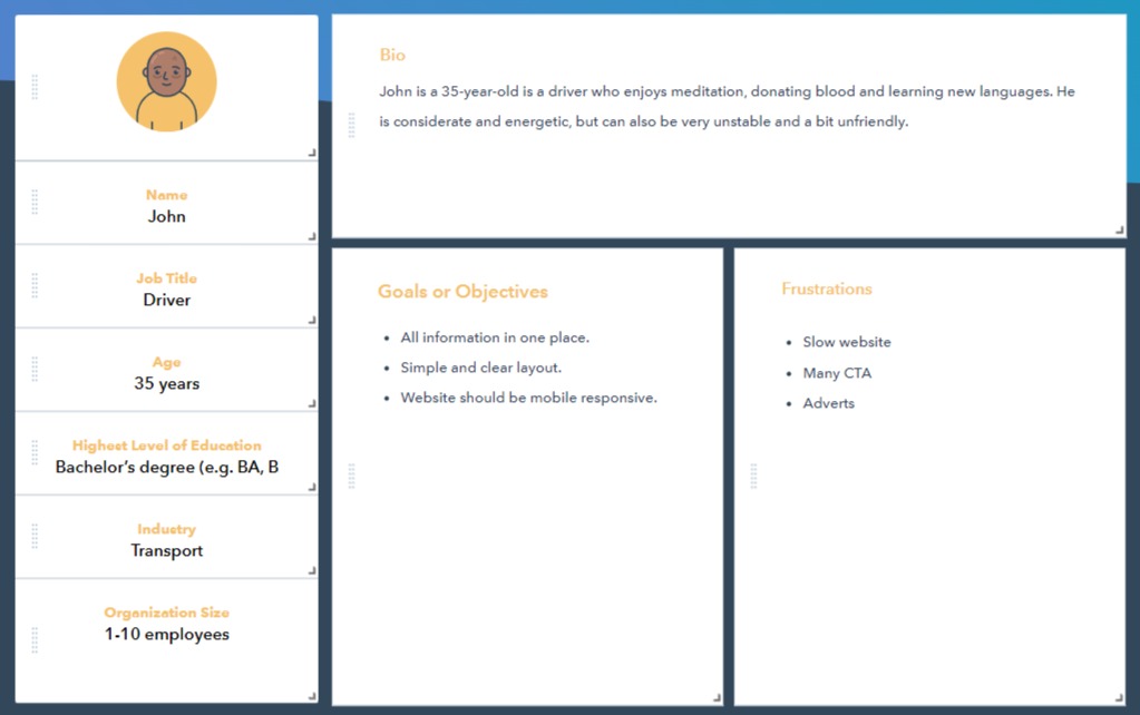
- User personas
- User journey maps
Using what I learnt throughout the research process, I created a user journey map to assist me understand what the user will experience when using this service.
On this phase I built out my design.
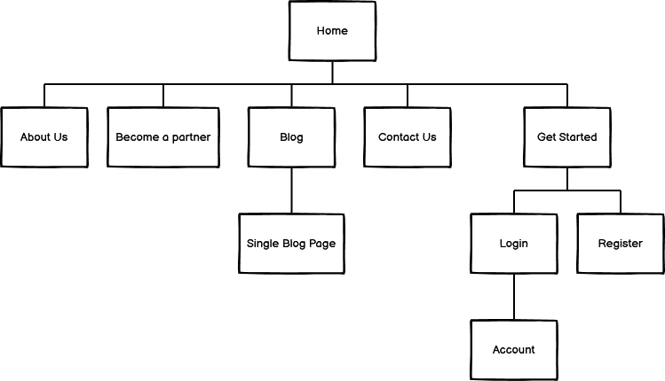
- Site map
- User flow
- Wireframe.
For this phase, after several designs and redesigns, we’re ready to launch. Feedback from the development team is critical. I make sure that any concerns that arise are properly communicated and addressed before the service release.
- Internal testing.
- User testing.
- Beta launch.
When the service becomes live, it’s time for another round of testing. I evaluate the finished project as a whole.
The questions below may vary depending on the business and are not limited to the questions below.
- How are users responding to the product?
- Was it effective in addressing their issues and eliminating their pain points?
- Where can I make improvements to the product?