This case study represents a comprehensive design process from problem identification through implementation, showcasing the strategic thinking and detailed execution required for successful product design.

About Client

Overview

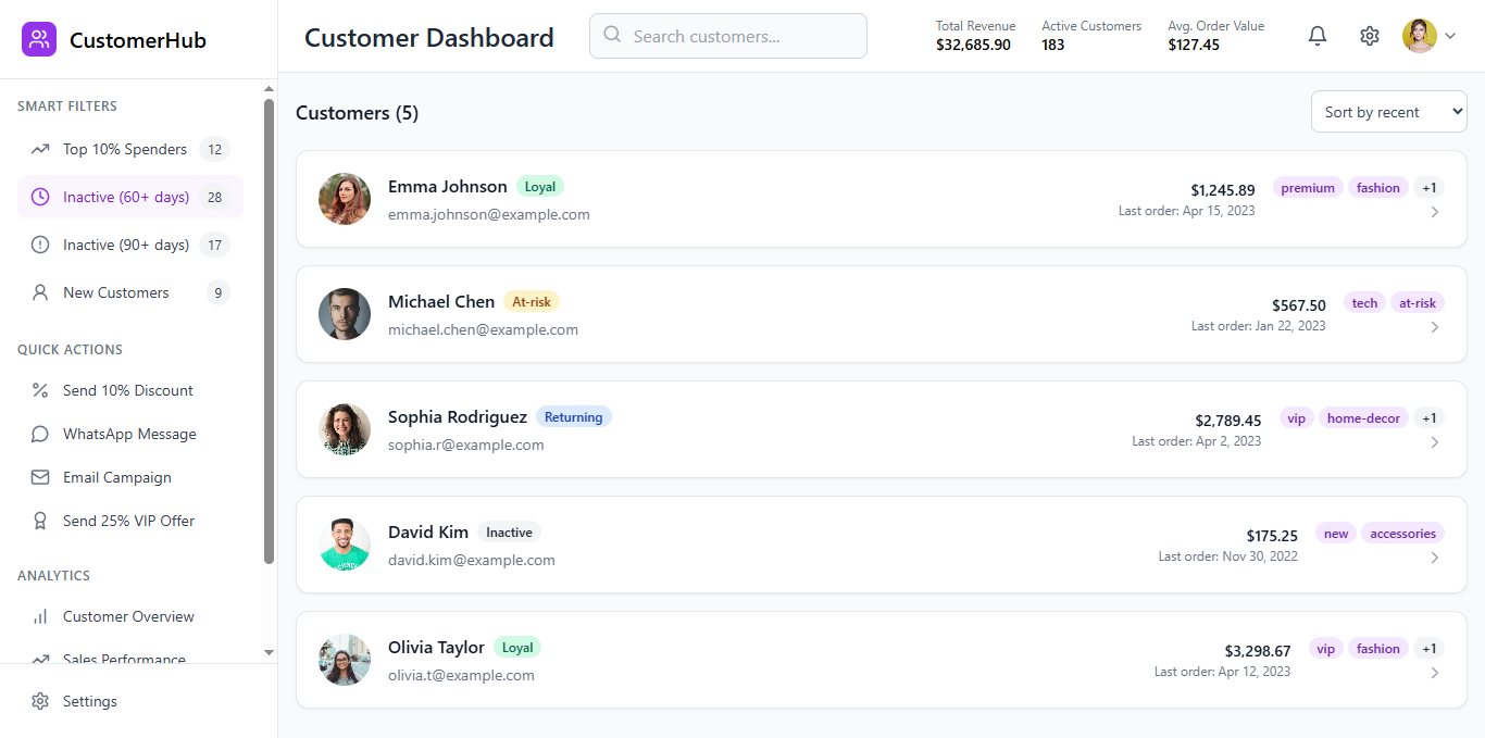
CustomerHub is a premium customer dashboard designed to empower marketing and customer success teams with a holistic, actionable view of their customer base. Moving beyond the traditional sales-focused CRM, CustomerHub prioritizes rich customer profiles, intelligent segmentation, and one-click engagement tools, all wrapped in a soft, branded, and intuitive user interface.

The Challenge

Traditional Customer Relationship Management (CRM) systems are often built with a sales pipeline in mind, focusing on lead conversion, deal stages, and sales performance. While invaluable for sales teams, this orientation frequently leaves marketing and customer success professionals underserved. They require a tool that emphasizes customer understanding, engagement, and retention, allowing them to identify key segments, personalize outreach, and foster long-term relationships.

The core challenge was to design a dashboard that:

  • Provides a comprehensive, yet easily digestible, view of customer data relevant to marketing and customer success.
  • Enables quick identification of customer segments (e.g., high-value, at-risk, new).
  • Facilitates immediate, personalized engagement actions.
  • Offers seamless integration points with marketing and e-commerce platforms.
  • Presents a premium, aesthetically pleasing user experience that feels more like a sophisticated marketing tool than a rigid sales CRM.

My Role

Senior Product Designer

The Team

  • Chidiebere Nweke 
  • Korede Oluwafemi
  • Chinelo Abia

Tools

Paper | Balsamiq | Figma

Methodology

Competitive Analysis, Mind Mapping, Card Sorting, User Personas, Systems Map, Site Map, User Flows, Wireframing, Prototyping, Usability Testing.

Timeline: 3 weeks

My Design Process

As a Senior Product Designer, my process for CustomerHub focused on understanding the complex needs of marketing and customer success, translating those into a clear product vision, and executing a design that is both functional and delightful.

MY UX DESIGN PROCESS

Before I begin any project, I try to understand the basics. This requires an understanding of two important aspects:

  • The user (Users and their goals)
  • The brand (Business goals)

The questions below may vary depending on the business and are not limited to the questions below.

  • What’s is the problem?
  • What issue are you trying to solve for your user?
  • What problem are you trying to solve?
  • How does this project fit into your overall brand mission and goal?
  • What role does this project play in reaching that goal?
  • Is now the ideal time for your business to pursue this project?

I undertake research once I’ve determined what this project’s fundamental objective is and what problems they’re attempting to solve. At this point, I prefer face-to-face interviews to measure verbal and nonverbal replies, although video or phone interviews was also used.

  • User Interview

  • Stakeholder Interview

  • Market Research

  • Competitor Analysis

The questions below may vary depending on the business and are not limited to the questions below.

  • What are they having trouble with?
  • What do people expect from the service?

In this step, I used all of the information obtained in the previous two phases to analyze and simplify the most relevant parts.

  • User personas
  • User journey maps

Using what I learnt throughout the research process, I created a user journey map to assist me understand what the user will experience when using this service.

On this phase I built out my design.

  • Site map
  • User flow
  • Wireframe.

For this phase, after several designs and redesigns, we’re ready to launch. Feedback from the development team is critical. I make sure that any concerns that arise are properly communicated and addressed before the service release.

  • Internal testing.
  • User testing.
  • Beta launch.

When the service becomes live, it’s time for another round of testing. I evaluate the finished project as a whole.

The questions below may vary depending on the business and are not limited to the questions below.

  • How are users responding to the product?
  • Was it effective in addressing their issues and eliminating their pain points?
  • Where can I make improvements to the product?

Discovery & Problem Framing

My initial step involved deeply understanding the target users: marketing managers, customer success specialists, and small business owners who manage customer relationships. Through hypothetical user scenarios and problem statements, I identified key pain points:

  • Difficulty in quickly segmenting customers based on behavior (e.g., recent activity, spending habits).
  • Lack of integrated tools for direct, personalized outreach (email, messaging).
  • Overwhelming interfaces in existing CRMs that obscure marketing-relevant insights.
  • A desire for a more visually appealing and intuitive tool that aligns with a brand’s aesthetic.

This led to the core problem statement: “How might we provide marketing and customer success teams with an intuitive, visually rich, and actionable customer dashboard that enables intelligent segmentation and direct engagement, fostering stronger customer relationships?”

Defining the Vision & Strategy

The guiding principle for CustomerHub was to create a “soft, branded dashboard that looks more like a marketing tool than a sales CRM.” This meant prioritizing:

  • Personalization: Emphasizing individual customer profiles with rich details and interaction history.
  • Engagement Focus: Designing for quick, direct actions rather than complex sales workflows.
  • Visual Appeal: A premium, approachable aesthetic that feels less like a data entry system and more like a strategic insights platform.
  • Actionable Insights: Presenting data in a way that immediately suggests next steps for engagement.

The strategic goals were to enhance customer understanding, streamline outreach efforts, and ultimately improve customer retention and lifetime value.

Information Architecture & User Flows

I mapped out the primary user flows, focusing on efficiency and clarity:

  1. Overview: Users land on a dashboard showing key customer metrics.
  2. Segmentation: Users apply smart filters to narrow down the customer list.
  3. Customer Selection: Users select a customer from the list to view their detailed profile.
  4. Profile Review: Users quickly grasp a customer’s history, spending, and interactions.
  5. Action: Users initiate a one-click engagement (e.g., send discount, message).

The information architecture was structured to support these flows: a persistent sidebar for navigation and filters, a main content area for the customer list, and a dynamic panel for the selected customer’s profile. Key information was prioritized on customer cards for quick scanning, with deeper dives available in the profile.

Interaction & Visual Design

The visual design was critical in achieving the “marketing tool” aesthetic.

  • Aesthetic Choices:

    • Color Palette: A soft, inviting base of grays and whites, accented with a vibrant purple for branding and key interactive elements. This creates a professional yet approachable feel.
    • Typography: Clean, modern sans-serif fonts were chosen for optimal readability and a contemporary look, ensuring data is presented clearly without feeling clinical.
    • Imagery: A deliberate choice was made to use personal, high-quality avatar photos (sourced from Pexels) in customer cards and profiles. This humanizes the data and reinforces the “rich profile” concept.
    • Layout: Generous use of whitespace creates a spacious and uncluttered interface, reducing cognitive load and drawing attention to important information.
    • Micro-interactions: Subtle animations, such as the fadeIn effect for the customer profile panel, were incorporated to provide a polished and engaging user experience, making transitions feel smooth and intuitive.
  • Component Design:

    • Customer Cards (CustomerCard.tsx): Designed for scannability, each card prominently displays the customer’s name, email, total spent, and last order date. Dynamic tags and segment badges (e.g., “loyal,” “at-risk”) provide immediate visual cues for quick segmentation.
    • Smart Filters (Sidebar.tsx): The sidebar houses intuitive filter categories like “Top 10% Spenders” and “Inactive (60+/90+ days).” Each filter includes a count and a relevant Lucide icon for quick recognition, making segmentation effortless.
    • Quick Actions (CustomerProfile.tsxSidebar.tsx): Strategically placed buttons enable direct customer engagement. Examples include “Send 10% Discount” and “Message via WhatsApp,” streamlining outreach efforts.
    • Customer Profile (CustomerProfile.tsx): This detailed view provides a comprehensive look at a customer, including lifetime value, last order specifics, editable tags, and a timeline of recent interactions. This reinforces the “rich profile” concept, offering context for personalized communication.
    • Dashboard Layout (Dashboard.tsx): The main dashboard dynamically adjusts, allowing the customer list to expand when no profile is selected and contracting to accommodate the profile panel, ensuring optimal use of screen real estate.
  • Responsiveness:

    • The design was built with responsiveness in mind, ensuring that the layout adapts gracefully to various screen sizes, from large desktops to mobile devices, maintaining usability and aesthetic integrity across all platforms.

Technical Considerations & Collaboration

While my primary role was design, I considered the technical implementation throughout the process.

  • Technology Stack: The choice of React for the frontend and Tailwind CSS for styling facilitated rapid development and ensured design consistency.
  • Component-Based Architecture: The design was broken down into reusable components (CustomerCardCustomerProfileHeaderSidebarDashboard), which aligns with modern development practices and promotes modularity.
  • Data Structure: Mock data (mockData.ts) was used to populate the UI, demonstrating the intended functionality and providing a clear blueprint for future integration with real data sources like Shopify (for orders) and Klaviyo (for campaigns). The types/index.ts file defines the data structures, ensuring clarity for developers.

Key Design Decisions & Rationale

1. Marketing-First Approach
Decision: Prioritize customer engagement over sales pipeline management
Rationale: Marketing teams need tools focused on customer relationships, not deal progression

2. Rich Visual Profiles
Decision: Include personal photos and detailed interaction history
Rationale: Humanizes customer data and enables more personalized outreach

3. One-Click Actions
Decision: Streamline common tasks into single-click operations
Rationale: Reduces friction in customer engagement and increases team productivity

4. Smart Filtering System
Decision: Pre-built filters for common customer segments
Rationale: Eliminates need for complex query building while providing powerful segmentation

5. Soft, Premium Aesthetic
Decision: Move away from traditional CRM visual language
Rationale: Creates tool that marketing teams want to use daily, improving adoption

Key Outcomes & Impact

CustomerHub successfully delivers a functional prototype that embodies the marketing-centric vision. It differentiates itself from traditional CRMs by focusing on actionable insights and personalized engagement, rather than just sales pipeline management.

The intuitive interface, combined with smart filtering and one-click actions, provides a clear and efficient tool for marketing and customer success teams to understand and engage with their customer base. The premium UI direction ensures a delightful user experience that aligns with a modern brand’s aesthetic.

User Experience Improvements

Reduced Time to Insight: Smart filters enable quick customer segmentation
Streamlined Workflows: One-click actions eliminate multi-step processes
Enhanced Customer Understanding: Rich profiles provide comprehensive customer context
Improved Usability: Intuitive interface reduces learning curve

Business Impact Potential

Increased Customer Engagement: Easier outreach leads to more frequent customer touchpoints
Better Customer Retention: Proactive identification of at-risk customers
Higher Team Productivity: Streamlined workflows save time on routine tasks
Improved Customer Lifetime Value: Better segmentation enables more targeted campaigns

Design System Success

Scalable Architecture: Component-based design supports future feature additions
Consistent Experience: Design system ensures cohesive user experience
Technical Feasibility: Design decisions align with development best practices
Brand Alignment: Premium aesthetic supports marketing team’s brand standards

Lessons Learned & Insights

Design Process Insights

1. User-Centered Approach: Starting with user needs rather than feature lists led to more focused solutions
2. Visual Hierarchy Importance: Clear information hierarchy crucial for data-heavy interfaces
3. Progressive Disclosure: Showing right amount of information at right time improves usability
4. Micro-interactions Matter: Small animations significantly impact perceived quality

Technical Collaboration

1. Early Technical Input: Considering implementation constraints during design prevents later issues
2. Component Thinking: Designing with reusable components in mind improves consistency
3. Data Structure Planning: Understanding data relationships crucial for interface design
4. Performance Considerations: Large customer lists require thoughtful loading and filtering strategies

customerhub