Fleet Management System

Designing a mobile operations platform for managing drivers, vehicles, compliance, and daily fleet operations.
Role
Product Designer — UX & UI

Team
Product Design + Client Team

Timeline
7 weeks

Users
In-house drivers and fleet administrators

Focus
Mobile workflows · Fleet operations · Information architecture · UX/UI · Prototyping · Usability testing
Fleet Management System

Designing a mobile operations platform that simplifies fleet management for drivers and administrators

Managing a large fleet isn’t simply a matter of tracking vehicles. It involves inspections, maintenance, fuel management, safety, compliance, reporting, scheduling, and communication—all while ensuring drivers can complete essential tasks without unnecessary complexity.

I designed a mobile fleet management experience for a large Nigerian conglomerate with more than 5,000 employees across multiple locations.

My focus was to translate complex fleet operations into simple, task-oriented workflows that drivers could use efficiently while giving the organisation a stronger foundation for managing vehicle operations, safety, compliance, and transportation costs.

Project Snapshot

Role
Product Designer — UX & UI

Timeline

7 weeks

Team

Product Design + Client Team

Users

In-house drivers and fleet administrators

Focus

Mobile workflows · Fleet operations · Information architecture · UX/UI · Prototyping · Usability testing
Executive Summary

The organisation relied on an existing desktop fleet management application to support its vehicle operations. However, many of the people interacting with the system were drivers working away from a desk, creating a mismatch between the way the system was structured and the environment in which they needed to use it.

The challenge was to design a mobile experience that made essential fleet tasks easier to complete while supporting the organisation’s broader goals of improving operational efficiency, reducing transportation costs, and managing vehicle-related risks.

I conducted research with in-house drivers and the administrator responsible for the existing fleet management application to understand how the current system worked, where users struggled, and what information they needed most frequently.

The research identified several recurring needs around:

  • Vehicle inspections
  • Fuel management
  • Vehicle maintenance
  • Health and safety
  • Compliance
  • Reporting
  • Task management
  • Notifications and reminders
  • Request history
  • Communication

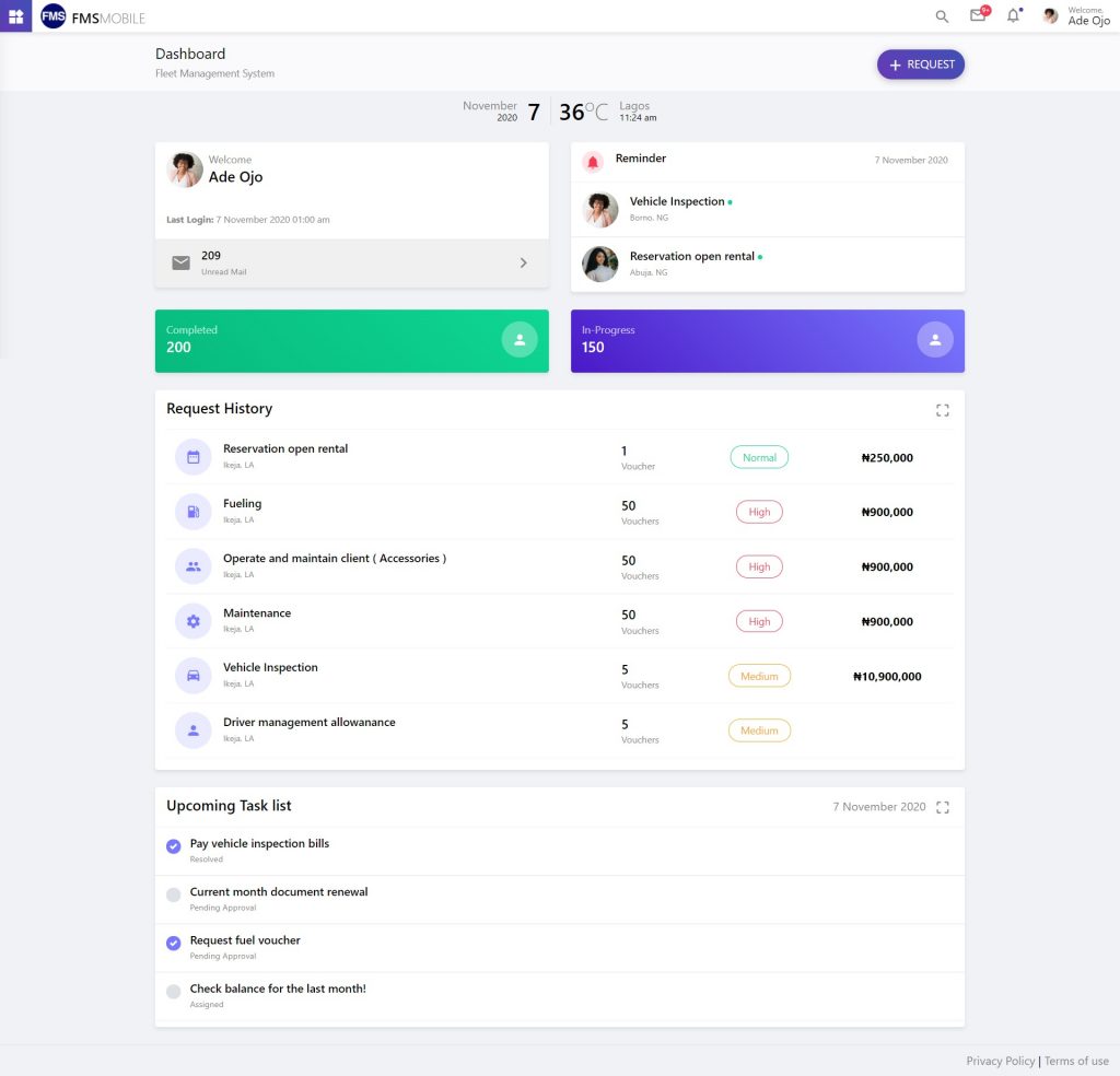
Rather than reproducing the complexity of the existing desktop system on mobile, I focused on creating a task-oriented experience that surfaced the information drivers needed most and reduced unnecessary navigation.

A key product decision was also made during stakeholder discussions: live driver location and movement would not be part of the mobile interface. GPS tracking would be handled by Engineering through the driver’s smartphone, allowing the product design to focus on the workflows drivers actually needed to complete.

The resulting experience brought essential fleet operations into a simpler mobile workflow while establishing a foundation that could be expanded through future testing and iteration.

Personas:

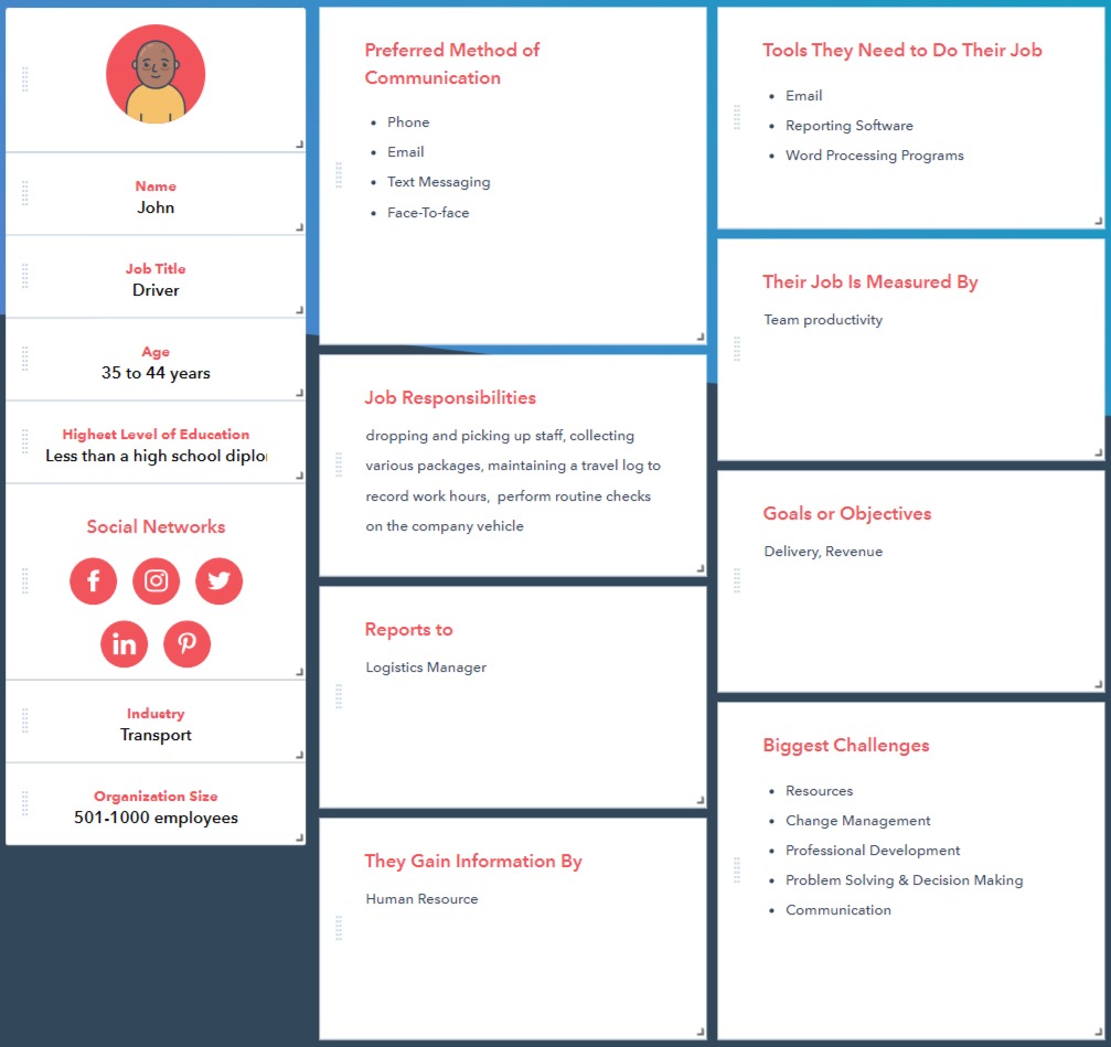
I created one personas to reflect the users I planned for: Drivers. Based on the user personas, I established the major user demands I wanted to address on the app, while also considering the client’s needs.

John

Competitor Analysis Research

Since this mobile app was to be used in-house (built only for the client to improve their efficiency and productivity and lower overall transportation and staff driver costs. ), my competitor analysis research was limited.

User Flows

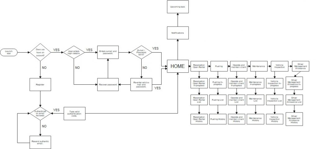
The purpose was to determine each driver’s stages while navigating the mobile app and activities to reach their goal. I created a user flow for the driver persona to tailor this experience to the driver’s objectives. This allowed me to concentrate on what the user needed to achieve and how to provide that experience in the most efficient way possible through my design.

Driver User Flow

The Operational Challenge

Fleet management is an inherently complex operational problem.

A single vehicle can generate information across inspections, fuel usage, maintenance, safety, compliance, driver assignments, requests, and reporting.

For the organisation, the challenge was not simply to digitise these activities. The system needed to help reduce operational risk, improve productivity, and control transportation and staff-driver costs.

For drivers, however, the problem looked very different.

They needed to complete specific tasks quickly:

What do I need to do today?

Do I have an outstanding request?

When is my next task?

Do I need to submit a report?

Has my vehicle inspection been completed?

What needs my attention?

This created the central design challenge:

How do we turn a complex fleet management system into a simple mobile experience that helps drivers complete the right task at the right time?

That question became the foundation for the product architecture.

What I Learned From Drivers

I conducted interviews with in-house drivers and the administrator of the existing desktop fleet management application.

The goal wasn’t simply to understand what features users wanted. I wanted to understand how fleet-related tasks fit into their day-to-day work and where the existing system created unnecessary friction.

Several recurring needs emerged.

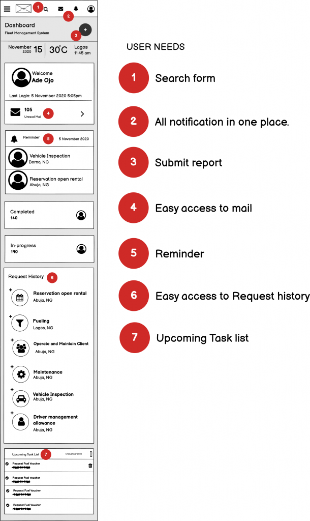
Drivers needed a single place for important information

Notifications, reminders, requests, tasks, and communication were spread across different parts of the existing experience.

Drivers needed faster access to routine tasks

Common activities such as submitting reports and reviewing requests needed to be accessible without navigating through complex menus.

Drivers needed visibility into what was coming next

Upcoming tasks and reminders were important because drivers often needed to plan around operational requirements.

Drivers needed access to history

Users wanted an easy way to review previous requests and activities without relying on administrators.

The system needed to work around real operational constraints

The client explicitly decided that live GPS tracking would be handled by Engineering rather than exposed as a primary driver-facing feature. This allowed the product experience to remain focused on tasks and responsibilities within the driver’s control.

These findings shifted the design direction from “mobile version of the desktop system” toward “mobile tool for completing fleet tasks.”

Key Product Decisions

01 — Design around tasks, not modules

The mobile experience was structured around what drivers needed to accomplish rather than mirroring the organisation’s internal fleet-management structure.

02 — Surface upcoming work

Tasks, reminders, and notifications were made prominent so drivers could understand what required attention.

03 — Reduce navigation for frequent actions

Common workflows such as reports, requests, and communication were made accessible from the primary experience.

04 — Separate operational complexity from the driver experience

Back-office and GPS functionality didn’t need to appear in the driver’s interface. The product was intentionally scoped around the driver’s responsibilities.

05 — Design for future expansion

The information architecture and reusable interface patterns were designed so additional fleet workflows could be introduced without restructuring the entire mobile experience.

Designing Around Driver Workflows

Once the research findings were synthesised, I mapped the key tasks a driver needed to complete throughout the product.

The user flow helped me identify which actions belonged together, where navigation could be reduced, and which information needed to be immediately accessible.

Rather than designing the application around the organisation’s internal structure, I organised the experience around the driver’s mental model:

Understand what needs attention → complete the task → confirm the result → move on.

This became particularly important for workflows such as submitting reports, reviewing requests, checking upcoming tasks, and responding to notifications.

The flow also helped identify opportunities to reduce unnecessary steps before moving into wireframes.

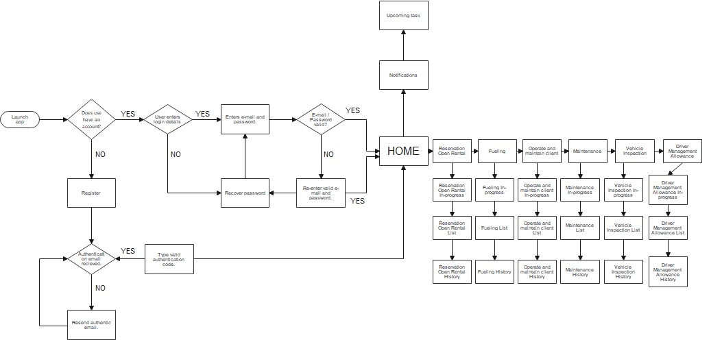
Designing Around Driver Workflows

Once the research findings were synthesised, I mapped the key tasks a driver needed to complete throughout the product.

The user flow helped me identify which actions belonged together, where navigation could be reduced, and which information needed to be immediately accessible.

Rather than designing the application around the organisation’s internal structure, I organised the experience around the driver’s mental model:

Understand what needs attention → complete the task → confirm the result → move on.

This became particularly important for workflows such as submitting reports, reviewing requests, checking upcoming tasks, and responding to notifications.

The flow also helped identify opportunities to reduce unnecessary steps before moving into wireframes.

Wireframes + Prototype

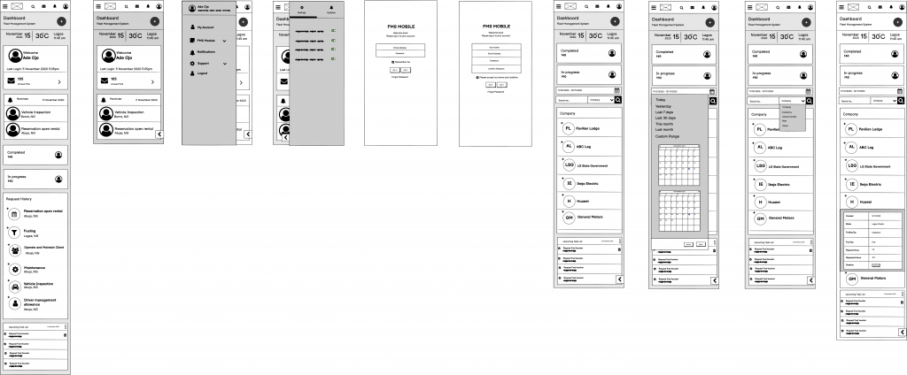
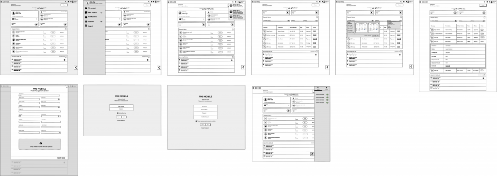
Using my user flows as a reference, I began sketching a handful of the app’s major displays.

Wireframing

Based on the feedback and personal insights I gained during the sketching phase, I began building my first wireframes in Balsamiq. I prioritized the features in the app that would best meet the needs of the users.

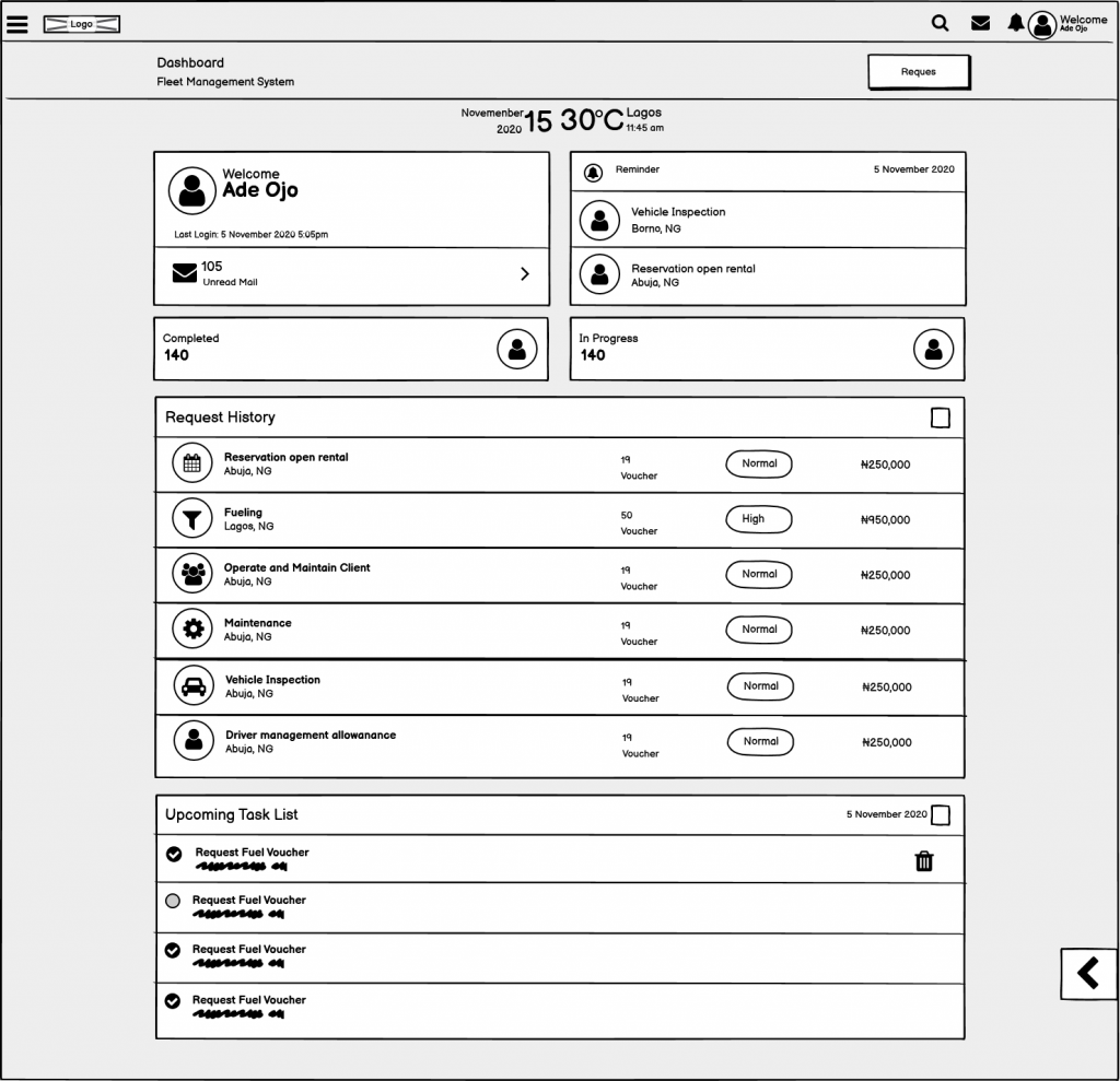
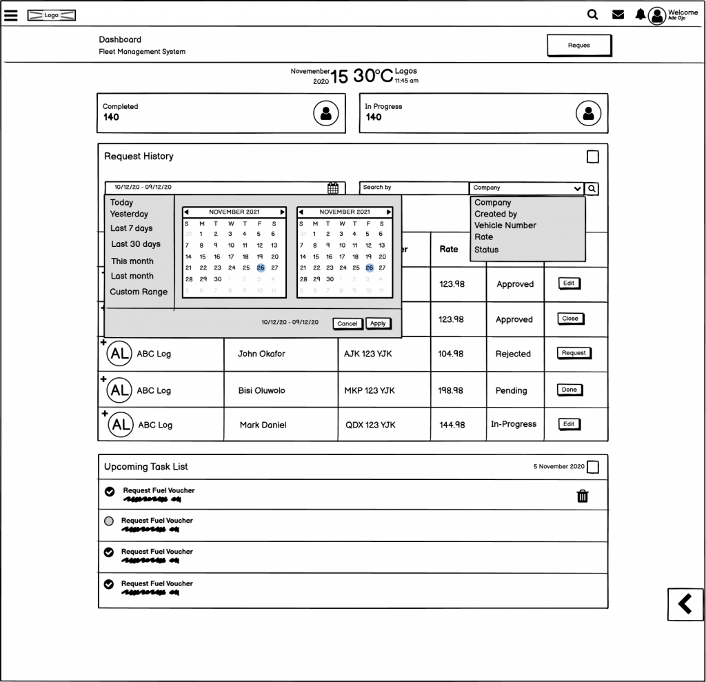
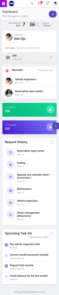
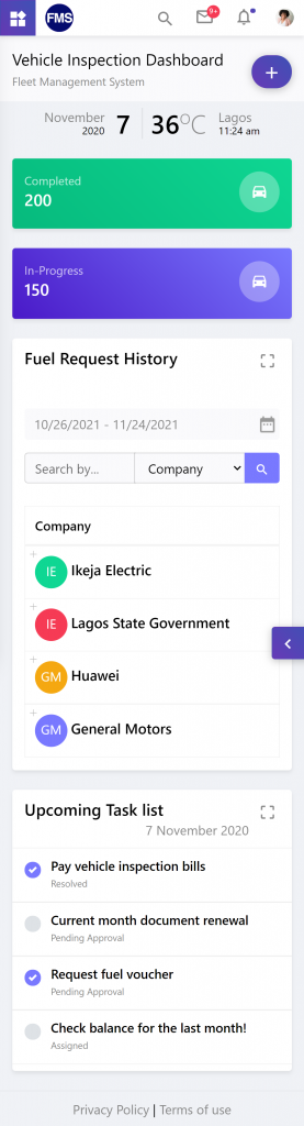
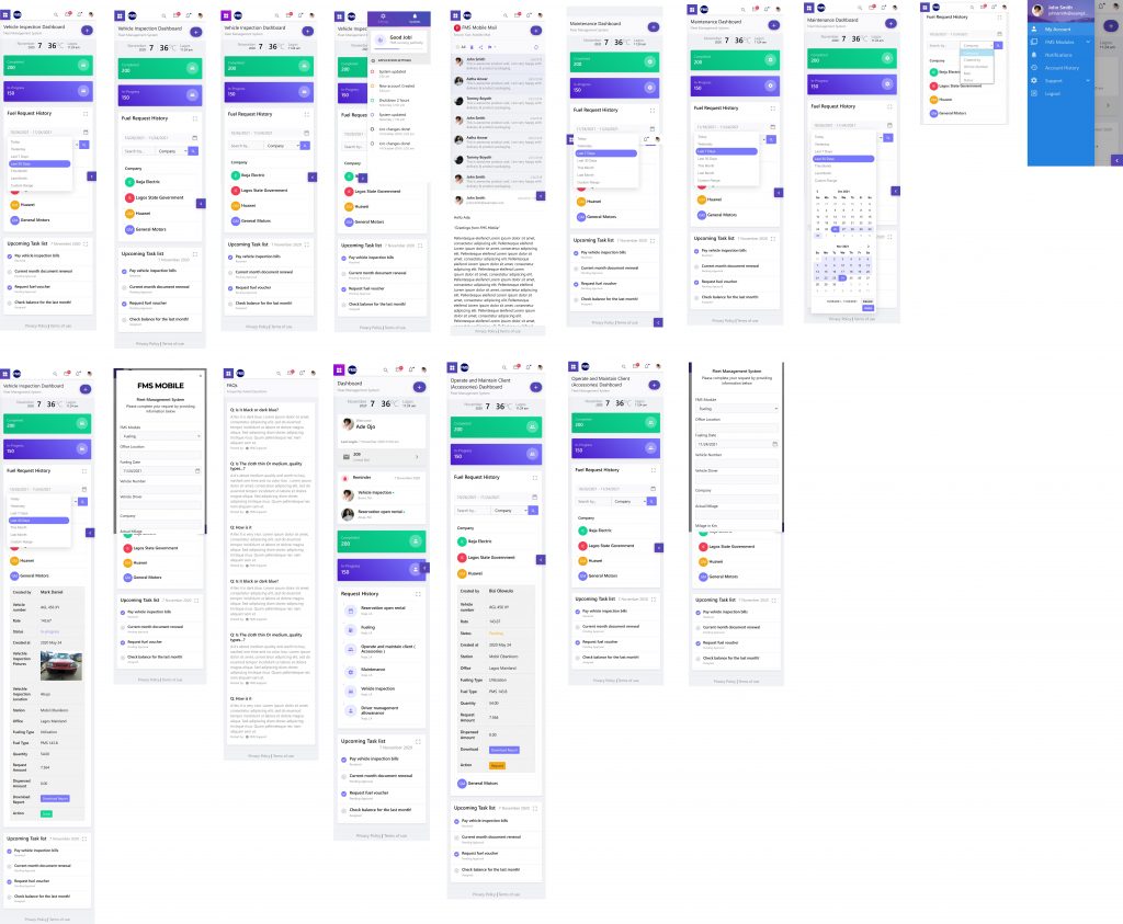
Responsive view

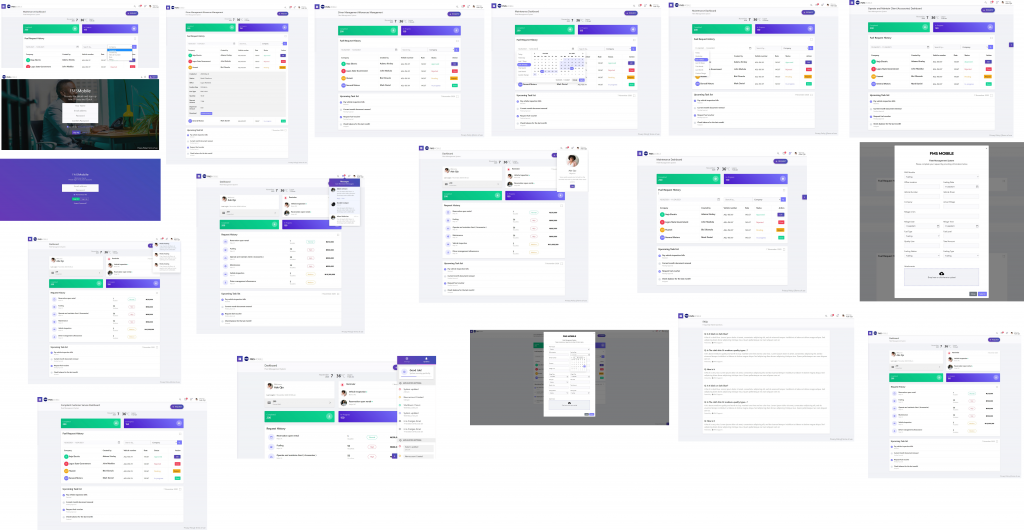
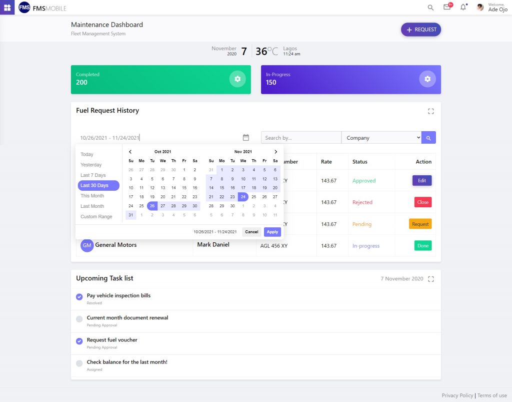
Hi-Fi Wireframe

Following a few more lo-fi wireframe iterations. I was able to design a more detailed aesthetics.

Responsive view

Usability Testing

After finishing my wireframes, I designed a prototype for usability testing. This would allow me to evaluate how users would engage with the design and validate that it met their needs (User and Business goals).

The Next Steps

The next steps I’d like to take for this project would be to keep performing usability testing and improving my designs.